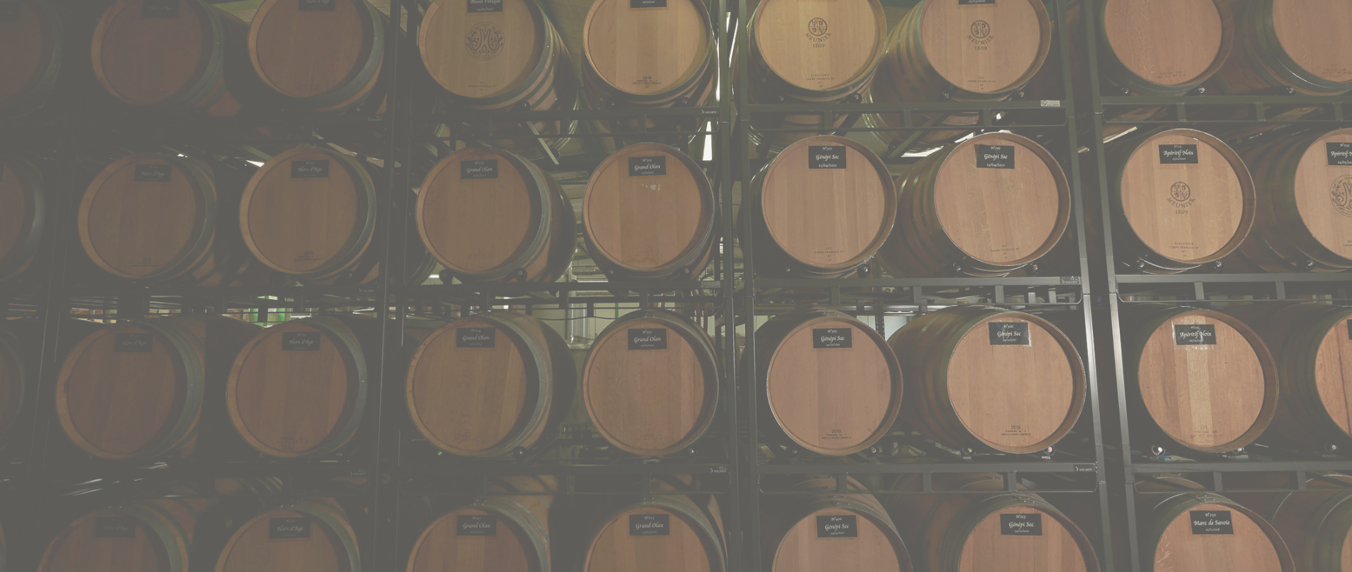
Our exceptional craftsmen: the new visual identity of Distillerie Meunier
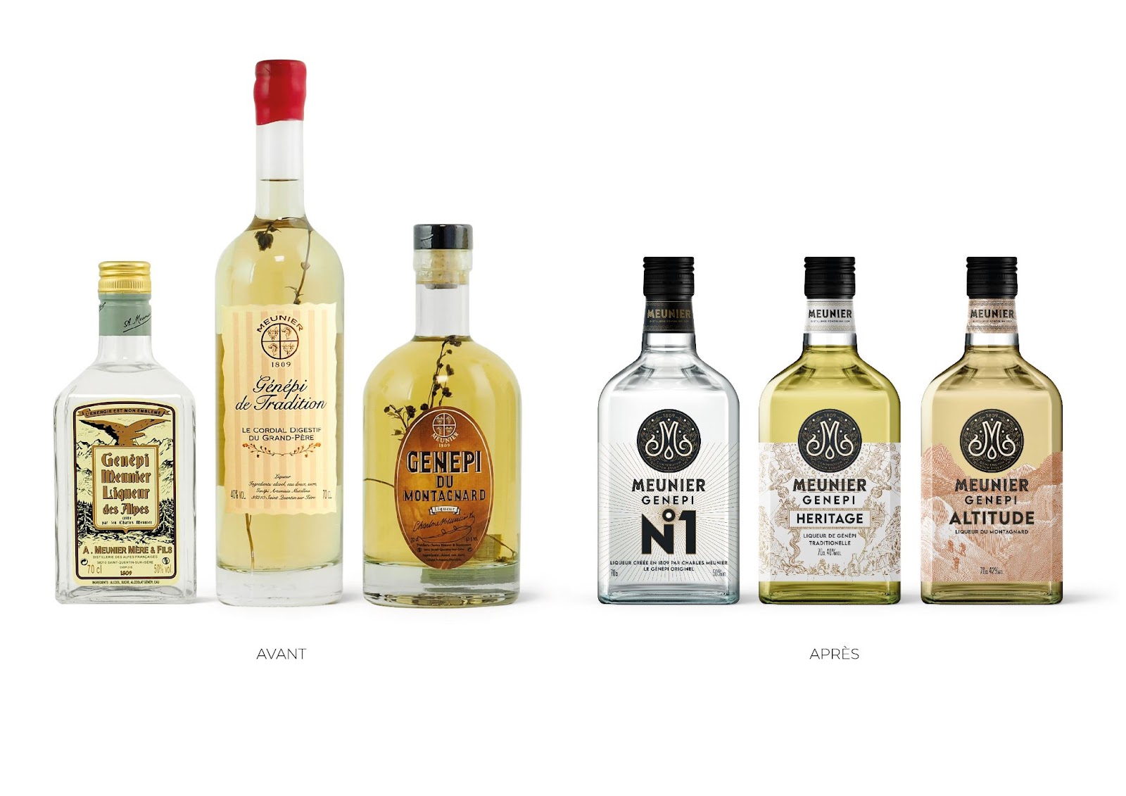
After more than 200 years of existence, Maison Meunier wanted to affirm its image, through a redesigned visual identity. This was particularly illustrated by the collection of genepi bottled by the house and the new coat of arms. Yann Guitton, independent graphic designer, and the Groupe Zebra Agency took care of the overhaul of this visual identity, as well as the creation of the packaging for the génépi bottles. A look behind the scenes of their creative process.
Inspired by the history of Meunier
With such an historical background, "why reinvent history?" asked Yann Guitton.
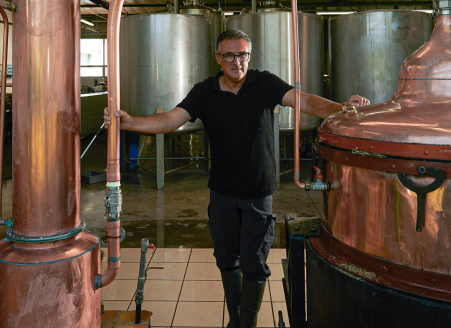
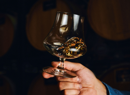
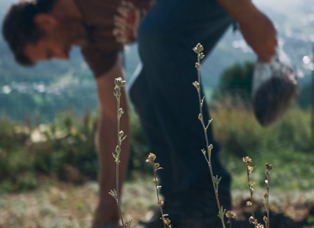
Indeed, the very essence of the Distillery lies in the blending of plants and the extraction of their quintessence, in the purest way possible. This heritage and know-how have been passed down through several generations, and are the greatest strength of the Maison Meunier.
A know-how that mixes tradition and modernity, turned towards nature, that had to be highlighted through this new visual identity.
Numerous historical codes allowed Yann Guitton and the Groupe Zebra Agency to create an identity that looked, looks and will look like the Maison Meunier.
The graphic elements
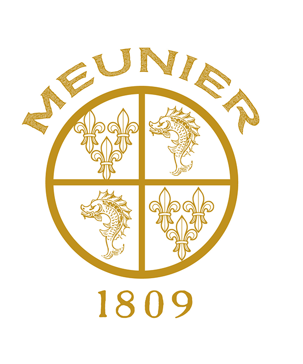
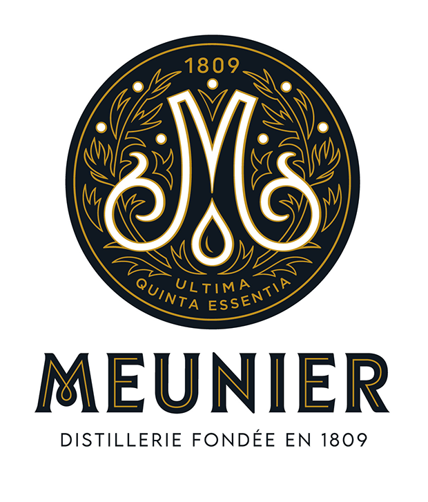
The coat of arms
The "M" that used to appear on the tin caps of 1800’s Meunier bottles was the starting point for the creation of the new coat of arms. The challenge was to give meaning to this already existing symbol.
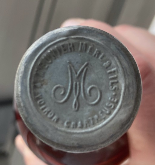
A new logo that tells a story, Maison Meunier’s one:
- The "M" which symbolizes both the shoots of the plant on the sides, and the still on the height which will allow the distillation,
- the drop which illustrates the essence of the plant resulting from the distillation, where all the aromas are concentrated,
- in the background, the plant which, in its wild aspect, climbs on the sides and in height, ready to be distilled.
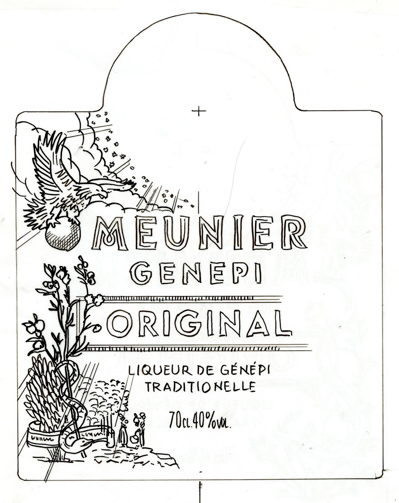
The bottles
For this new collection of genepi, it is a return to basics with a bottle whose shape is the same as that used for the first genepi, 150 years ago. A bottle with pure lines that seems carved in rock crystal. A bottle all in transparency, which offers a case to the quintessence. A bottle with a contemporary shape, which offers a real promise of experience, marvelous and extraordinary.
Each genepi has its own recipe, with its own aromas. Each design is therefore unique.
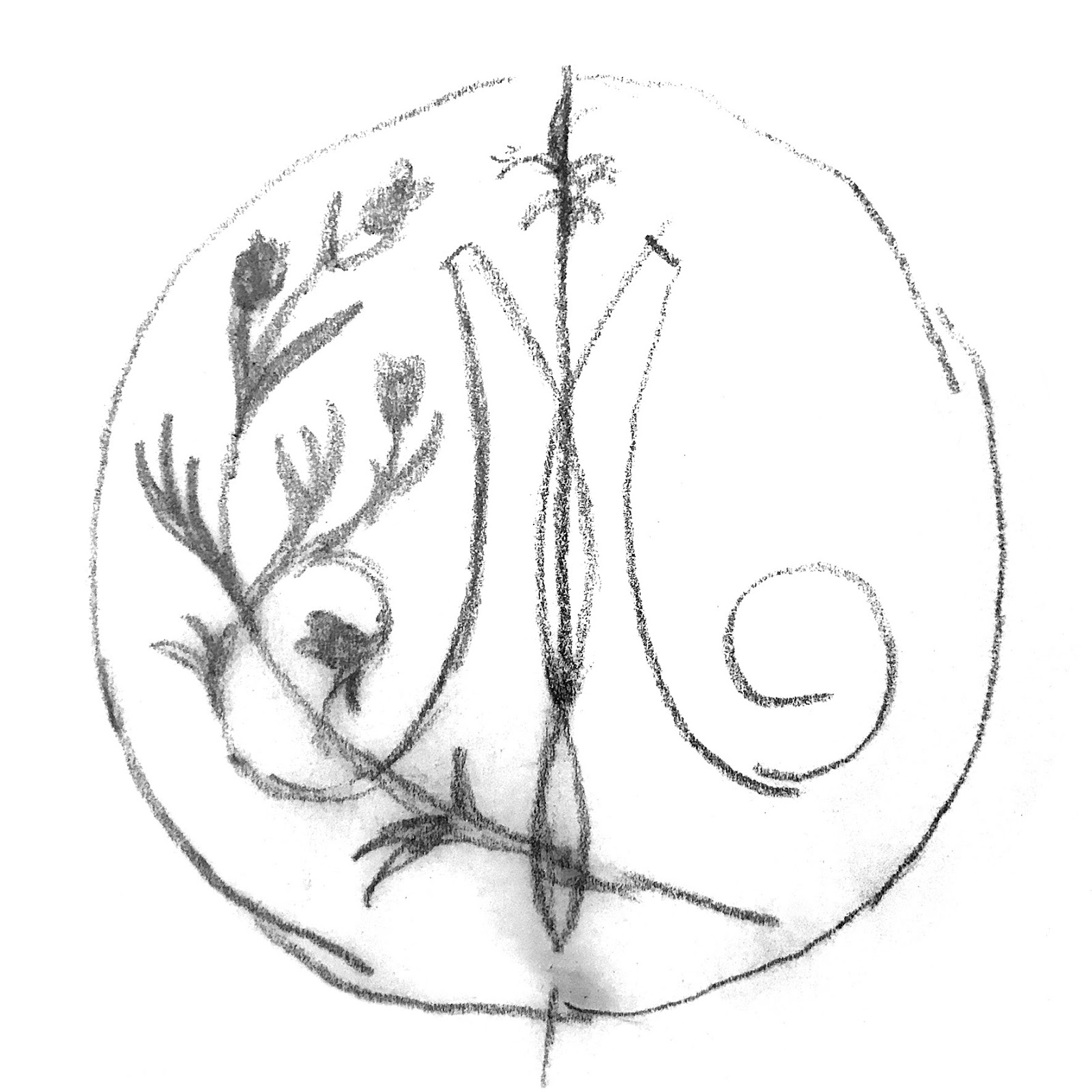
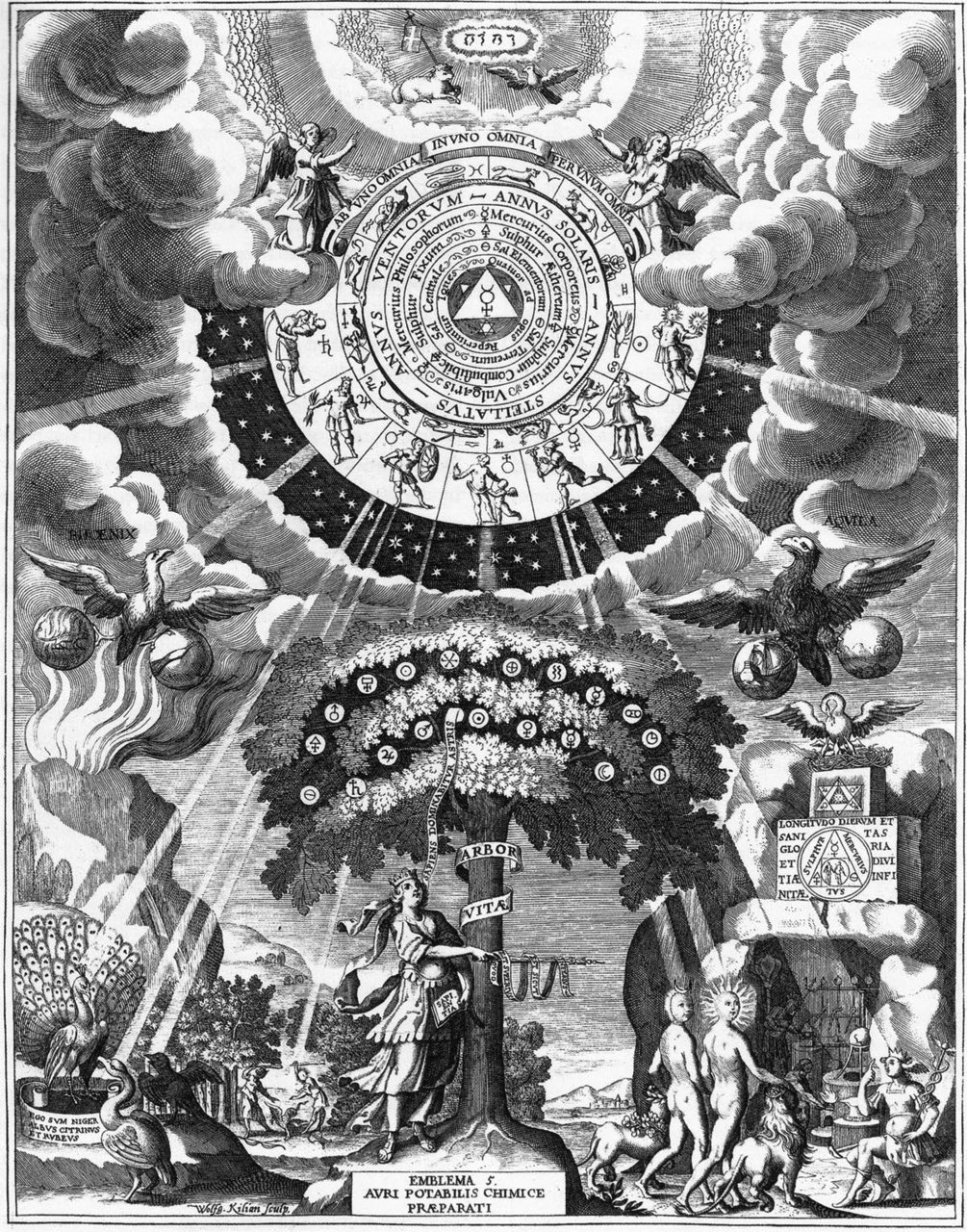
- Genepi Héritage: the illustrations on the bottle are inspired by alchemists' manuals, recalling the ancestral traditions of this genepi liqueur.
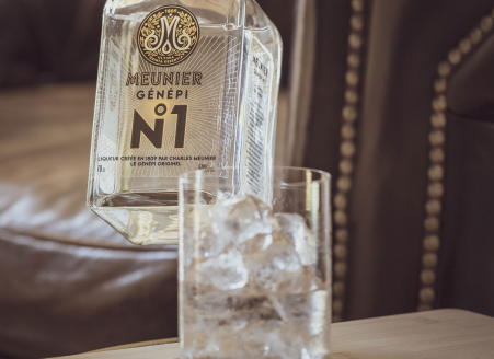
- Genepi N°1: the bottle of the emblematic recipe of the Maison Meunier, whose center of the "N" symbolizes the flower of the plant, which represents the genesis of genepi.
- Genepi Altitude: a label with a deep illustration of the harshness of mountain life, which metaphorically represents the strength of this genepi liqueur.
You can find our different genepi on our online store or via our distribution network throughout France!
Are you of legal drinking age in your country of residence?
ALCOHOL ABUSE IS HARMFUL. PLEASE DRINK RESPONSIBLY.